I like this photo because it occurs to real life. This photo was taken as part of the "Document this! - A discussion about the trials & tribulations of documentary filmmaking. I feel this is a real life photo. People discussing issues not paying attention to there body movement. However, I do not like this photo because it is so dark.
 This photo was also taken from the set up of Made in LA. I personally like the messy objects it adds the photo. Almost everything in this photo is unorganized. I like how the eye moves from one object to another.
 I chose to take picture of the set up in take down. This is a photo taken from the set up of Made in LA . A film directed by Alumudena Carracedo. I like this photo due to the wonderful colors on the fabric.
 This is the picture I decided to use for shutter speed. You can see I am moving. I think I was dancing with the umbrella. I like the wind in my air balancing with the wind in the trees. This is my favorite picture of the three to show shutter speed.
 We could not figure out how to make the flower focus and the leaves be out of focus. We got close but I do not think we nailed it.
 This photo shoot was not what was expected. As a class we were given a camera we have not ever used before. My group and I could not figure out how to use this camera even, after reading the manual and playing with the controllers. I did not get a chance to take a lot of pictures. This is our aperture picture. The picture we wanted was the shadows being and the trees but as you see it did not happen that way.
 I like this photo because it shows action. This photo was difficult to get in focus due to the movement in the shoot. I had to take the photo before the player actually hit the ball. Overall, it came out nice because the way eye movement.
 Crowd interaction is the most important due to the cheers and boos. I like the color there is repletion because the gold and green the people are wearing and the colors of the background.
 I like this photo due to the intensity of the models face. Her leg is in an usual position which makes the eye go directly to her. I cropped this photo. I lowered the contrast and brightness. I also used curve and levels to make the photo appealing.
 I dislike this photo because the there is not a center focus. The eye wonders around you do not know if you should look at the colors in the bunches or if you should look at the model or the truck in the background. I also do not like the ambient lighting. Over all, the photo is to busy.
 I like this photo because of the angle I took the photo. I love the ambient lighting on the lock. I like the shadows and reflection. I think the natural colors on in the background makes the gold lock stand out.
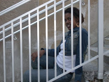
 This was my only picture of the object I had in focus. I dislike this photo because I feel the door was showing to much. The viewer would be confused on my objective of the photo. I want all my images to be relatable.
 I like this photo because of the simplicity. I love the way the leaves make your eyes move. I like the red from the brick. I think the shadows add to this photo. This picture in my opinion is equally balanced throw out.
 I dislike this picture because I feel it is to dark. I do not like how the leaves are draped it covers the other images in the picture and it hides the beautiful shadows
 I choose to do a direct approach for this photo due to all the organic shapes in the background.. I did not want the viewer to be confused. There is a lot of texture in this photo from the leaves to the metal pole. This photo is full of repetition from the the color, leaves and even the shapes. Like Zuckerman's photo the landscape is used like a frame drawing your eye the model. The leaves and branches going in different directions adds movement. The model wearing bright colors makes her stand out, but the contour of her coat balances her with the photo. The ambient light makes the image appear organic, like the model is in the middle of a rainforest. Overall, the picture was designed to be mysterious and make the viewer think beyond the image and not look at the obvious.


 model. The view eye moves due to the weird angles of the leaves and branches. In the first three images the trees frame the photos. Their is repetition in all of the photo which was the idea when deciding what picture to make.
 Jim Zuckerman: Deer MS-653
 I changed the contrast and made the shadows darker then the original. I changed the lighting by using curves.